ZIGROS – Creative Solutions for the Digital Age

Why Minimalism is the Future of Graphic Design
Why Minimalism in Graphic Design is the Future

Minimalism has become a defining trend in graphic design, and its influence shows no signs of slowing down. Rooted in simplicity and clarity, minimalism focuses on removing unnecessary elements to create impactful and elegant designs. In a world saturated with information, this approach offers an aesthetic and functional solution for brands aiming to stand out. Here’s why minimalism is the future of graphic design. 1. Minimalism Enhances Visual Clarity With fewer distractions, minimalist designs ensure that the audience can focus on the core message. By eliminating excessive details, designers can guide the viewer’s attention to what truly matters. For example: 2. It Reflects Modern Consumer Preferences Today’s consumers are drawn to simplicity and functionality. Busy, cluttered designs can feel overwhelming, while minimalist aesthetics evoke calmness and professionalism. Why this matters: 3. Minimalism is Timeless Trendy designs may fade, but minimalism remains relevant. Its timeless nature ensures that brands can maintain consistency without constantly overhauling their visual identity. Key Insight:By focusing on essential elements, minimalist designs transcend fleeting trends, making them a sustainable choice for long-term branding. 4. Adaptability Across Platforms Minimalist designs translate seamlessly across various mediums, from digital interfaces to print. As brands extend their presence to multiple platforms, a clean, cohesive design becomes even more valuable. Advantages include: 5. Supports Eco-Friendly Practices Minimalist graphic design often reduces the use of materials in print media. This aligns with eco-conscious branding strategies, helping companies appeal to environmentally aware consumers. Example:Minimalist packaging not only looks elegant but also reduces waste, showcasing a brand’s commitment to sustainability. 6. Minimalism Boosts Brand Recognition A minimalist approach often uses clean lines, bold typography, and limited color palettes, making it easier for audiences to recognize and remember a brand. Case Study:Nike’s iconic “swoosh” logo is a minimalist masterpiece, proving how simplicity can make a powerful statement. 7. Simplified Messaging Resonates Better Incorporating minimalism in graphic design helps simplify complex ideas, making communication more effective. This is especially important for brands aiming to deliver a clear message in a cluttered digital landscape. How to Incorporate Minimalism into Your Graphic Design Focus on Essentials: Identify the most important elements and remove anything that doesn’t serve a purpose. Use White Space: Strategically use white space to enhance visual hierarchy and readability. Choose Simple Typography: Stick to clean and modern fonts to maintain the minimalist aesthetic. Limit Colors: Use a cohesive and restrained color palette to avoid overwhelming the audience. Conclusion Minimalism is not just a design choice—it’s a philosophy that aligns with the evolving demands of modern consumers. Its focus on simplicity, clarity, and functionality ensures that it remains a dominant force in the future of graphic design. Brands that embrace minimalism will not only stay relevant but also strengthen their connection with their audiences.

The Ultimate Guide to Color Psychology in Graphic Design
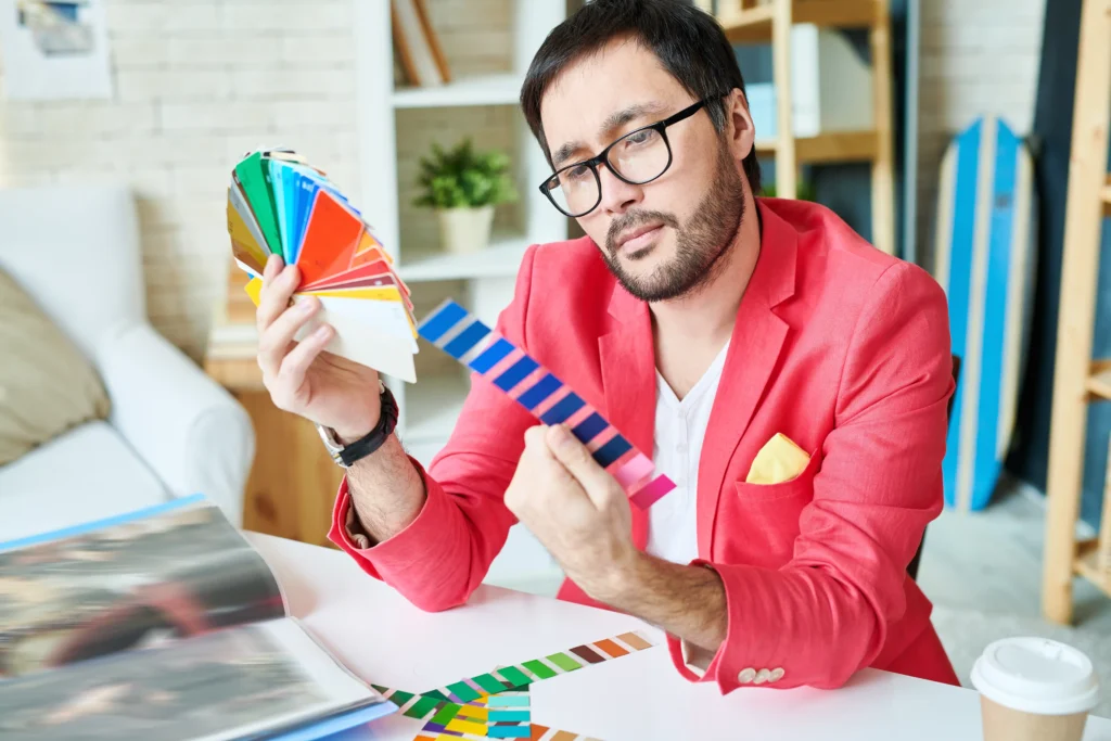
The Ultimate Guide to Color Psychology in Graphic Design

Color plays a vital role in graphic design, influencing emotions, perceptions, and decision-making. Understanding color psychology enables designers to create visuals that effectively communicate a brand’s message and resonate with audiences. This guide explores the fundamentals of color psychology and how to apply it in graphic design. 1. What Is Color Psychology? Color psychology studies how colors affect human behavior, emotions, and perceptions. Different colors evoke specific feelings, which can influence a viewer’s response to a design. For example: 2. The Importance of Color in Graphic Design Colors are more than aesthetic elements; they are tools for communication. A well-chosen color palette can: 3. Breaking Down Colors and Their Psychological Impact Red: Bold and Energetic Blue: Calm and Trustworthy Yellow: Optimistic and Cheerful Green: Natural and Balanced Purple: Luxurious and Imaginative Black and White: Classic and Timeless 4. How to Use Color Psychology in Graphic Design Step 1: Define Your Brand’s Personality Identify the emotions and values your brand represents. For example, an eco-conscious company might lean toward green and earthy tones. Step 2: Consider Your Target Audience Colors evoke different emotions across cultures and demographics. Research your audience to ensure the color palette aligns with their preferences. Step 3: Use Color Hierarchy Guide viewer attention by prioritizing colors. Use bold colors for headlines and softer tones for backgrounds. Step 4: Balance Your Palette Avoid overloading your design with too many colors. Stick to 2-4 main colors to maintain harmony and clarity. Step 5: Test Across Mediums Colors can appear differently on digital and print mediums. Always test your designs for consistency. 5. Common Mistakes to Avoid Conclusion Color psychology is a powerful tool in graphic design, enabling you to connect emotionally with your audience and convey your brand’s essence. By understanding the psychological impact of colors and strategically applying them, you can create designs that captivate and inspire.

How to Choose the Perfect Font for Your Brand
How to Choose the Perfect Font for Your Brand

Your brand’s font is more than just a typeface; it’s a key component of your identity. A well-chosen font can communicate your brand’s values, tone, and professionalism, while the wrong choice can confuse your audience. This guide will help you choose the perfect font for your brand design to ensure your visuals leave a lasting impression. 1. Understand Your Brand Identity Before selecting a font, clarify your brand’s personality and tone. Are you professional, playful, elegant, or bold? Your font should align with these traits. Example: 2. Prioritize Readability While aesthetics are important, readability is crucial. Your font should be legible across all mediums, from websites to business cards. Avoid overly intricate fonts for body text. Pro Tip: Test the font on different devices and sizes to ensure it’s easy to read. 3. Match Fonts with Your Industry Different industries have unique design trends. Choosing a font that resonates with your field helps establish credibility and trust. 4. Combine Fonts Strategically Pairing fonts can enhance your design, but balance is key. Use one font for headings and another for body text, ensuring they complement each other. Tip: Limit your design to two fonts to maintain consistency. 5. Choose Fonts That Are Scalable Your font will appear on everything from small logos to large billboards. Select a font that maintains its quality and impact regardless of size. 6. Consider Your Color Palette The interaction between your font and your brand’s colors affects how it’s perceived. Ensure your font contrasts well with your background and supports your visual hierarchy. 7. Test the Font with Real Content Before finalizing, test your font with actual brand content to see how it aligns with your message. Use your logo, website, and social media posts for this evaluation. 8. Avoid Trendy Fonts Trendy fonts might seem appealing but can quickly become outdated. Opt for timeless fonts that ensure longevity and adaptability. 9. Invest in Licensing Ensure your chosen font is licensed for commercial use, especially if your brand will use it extensively. Explore platforms like Google Fonts for free options or premium sites like Adobe Fonts. 10. Seek Professional Input If you’re unsure, consult a graphic designer. Professionals can help you select a font that aligns with your brand and elevates your overall design. Conclusion Choosing the perfect font for your brand design is about finding harmony between style, readability, and identity. A thoughtful selection ensures your brand communicates effectively and stands out in a crowded market. Elevate your brand by choosing fonts that resonate with your values and captivate your audience!

Top 10 Graphic Design Trends 2024: Stay Ahead in Design

The graphic design industry continues to innovate in 2024, offering trends that redefine creativity and engagement. From AI integration to 3D graphics, these trends are vital for designers aiming to stay competitive. Let’s explore the top 10 graphic design trends for 2024 and how they can transform your creative projects. 1. AI-Driven Graphic Design Artificial Intelligence (AI) is reshaping graphic design by streamlining workflows and inspiring creativity. Designers use AI tools like Adobe Firefly and MidJourney to create layouts, textures, and mockups efficiently. 2. Immersive 3D Graphics 3D design is no longer just for product mockups. It’s being used across digital platforms to create hyper-realistic visuals that enhance user experiences. 3. Bold Minimalist Typography Typography is becoming more impactful with bold fonts and clean layouts dominating designs. This trend enhances readability while maintaining visual elegance. 4. Retro-Futuristic Aesthetics Retro design meets futuristic elements, creating unique styles that appeal to diverse audiences. Expect neon palettes, pixel art, and vintage-inspired typography. 5. Eco-Conscious Design Sustainability is more than a buzzword; it’s a design philosophy. Eco-conscious designs incorporate organic textures, earthy tones, and visuals promoting green initiatives. 6. Interactive Motion Graphics Motion graphics captivate audiences by turning static visuals into dynamic, engaging experiences. This trend thrives on platforms like Instagram and TikTok. 7. Inclusive and Diverse Visuals In 2024, graphic design emphasizes inclusivity by representing various cultures, genders, and identities in visuals. 8. Engaging Data Visualization Data storytelling is an art, and 2024 is all about making it visually compelling. Designers create stunning infographics that simplify complex data. 9. Augmented Reality (AR) in Design AR technology integrates physical and digital experiences, from virtual product try-ons to interactive marketing campaigns. 10. Vibrant Gradients and Holographic Effects Gradients have evolved into bold, vivid color transitions, often paired with holographic textures to create futuristic designs. Why These Trends Matter These graphic design trends for 2024 are shaping the industry by combining creativity with cutting-edge technology. By integrating them into your work, you can stay relevant and captivate your audience.